Monday, October 25, 2010

October 25, 2010 - Beverly Hills Adult School Fraktur Class #7

Beverly Hills Adult School Fraktur Class #7: Today DeAnn demonstrated gilding on a sample decorative capital, then had students practice gilding on their own.

For inspiration, this is long-time DeAnn student Trini's beautiful illuminated manuscript project:

Trini with her beautiful illuminated manuscript piece from a few years ago.
Detail of Trini's piece.


When creating the decorative capital, do the gilding first, then the painting with gouache. The gold could stick to the gouache if you paint first.

Recipe for Adhesive:
2/3 Sobo glue
1/3 water
some red watercolor to tint it so you can see it when dry

sample "M" on pergamenata

Painting the adhesive onto the pergamenata: Don’t use your best brush (i.e. the Winsor & Newton Series 7), but if you have detailed areas, use a brush with a good point. Pull the glue toward you for more control. It’s OK if you go into the design areas, you can always correct that later. Go over the pencil outline to its outer edge.


Paint 3 thin layers of glue. Make sure each layer dries completely before painting on the next layer of glue. Rinse your brush after each layer so that the glue doesn’t dry on the brush.


DeAnn has sheets of patent gold for purchase. She buys in bulk from Easy Leaf.

Use scissors reserved for “gold only” – clean it with silk. Cut a strip of gold if that’s all you need. It’s easier to work with a smaller size suited to the size of your glued area than with the whole sheet.


Once the glue is dry, breathe on it to re-moisten the glue (BEWARE: remove any lipstick or chapstick from your lips first). Then place the gold-leaf on top (gold side down) and press gently.

Remove the backing. Using a soft brush, brush away the excess gold.

Using a #16 blade in your x-acto knife, scrape the edges of the letter to smooth it and remove any gold glued on outside the outline.


Burnish the gold with an agate burnisher. You can also user a Griffold burnisher or other non-agate burnisher, but protect the gold with glassine and burnish over that.


Gilding completed!

After her demo, DeAnn had the students gild letters for practice.

TIP: At the smaller nib size like 1 1/2 mm, right after you dip your pen, the letters can be goopy from too much ink. Put a post-it or a scratch paper nearby to write some zig-zags. A paper towel will just soak up the ink.

TIP from Nan: When working on the pergamenata, try working with a “guard” sheet to protect the pergamenata from oil from your hands. This sheet can also be used to write off the excess ink.

Correcting mistakes on pergamenata: Using the #16 blade, scrape off the mistake. Scrape in all directions to remove the ink. Erase the area with a white eraser (e.g. Staedtler). Once you’ve erased the mistake away, you can write over it.


All gone!

HOMEWORK: Continue practicing your text at 1 ½ mm size. It’s OK to write your text on the pergamenata. Once you have the decorative capital outlined, gild it. DeAnn will help you with any issues next class.

Sunday, October 24, 2010

October 18, 2010 - Beverly Hills Adult School Fraktur Class #6

Beverly Hills Adult School Fraktur Class #6:  DeAnn demonstrated painting with gouache on a sample decorative capital on the pergamenata paper that will be used for the illuminated manuscript project. She also brought many books on illuminated manuscripts for everyone to look at and get ideas for their project. Bring your digital camera to take pictures of the designs that you like.


Practicing on bond paper:  Because the Borden & Riley smooth cotton comp paper is transparent enough to see the project template through, DeAnn suggests practicing on that. She has sheets to give or you can buy a pad from her. If you’re still practicing at the 2 ½ mm Brause nib size, go down to the 1 ½ mm Brause nib (x-height = 2 boxes) since that is the size for the project. Practice writing your text.


Using the lead holder with 2H lead:  for lining calligraphy projects and tracing letters or decorative, DeAnn highly recommends using a lead holder with 2H lead, because you can’t get a sharper point on a graphite pencil than using the lead pointer on this pencil.


The lead holder will come with HB lead, which is too soft for lining. DeAnn has 2H lead for purchase. To sharpen the lead, push the end of the holder to release quite a bit of lead. Look closely at the top of the lead pointer – there are two holes, one with a sharp triangle, the other with a square top. Place the lead into the hole with the sharp triangle, then push the end of the holder to bring the body of the holder to that level. Then clasp the lead pointer in your left hand, place the lead holder into the cylinder, and rotate clockwise until the grinding noise disappears. Your lead is now very sharp. Push into the white felt pad to remove any graphite dust.

DEMO of painting with gouache: First, trace a decorative capital onto the pergamenata scrap, like the sample “S” handed out in class last week. If you can, use a pencil with 2H lead. 2H lead is also available for mechanical pencils at art stores. DeAnn has lead sharpeners for mechanical pencil lead for purchase.

Gouache is an opaque watercolor. It comes in tubes of various light fastness ratings. DeAnn uses Winsor & Newton Designers’ Gouache. For the illuminated manuscript project, you will need permanent white and at least 3 other colors of your choice. Look at the illuminated manuscript examples for ideas on color combinations. You don’t have to stick to a historical palette (for example, red, blue, and yellow). Try different combinations of colors that you like.

Difference between Permanent white and Zinc white: Permanent white is more opaque, so it’s better for painting and using to mix with other colors. Zinc white has pigment that is ground finer, so it’s better for writing.


Set up your workspace: have 2 water containers, one for dirty, one for clean. Always rinse brush in the dirty container first, then rinse again in the clean container.

Using gouache:  DeAnn chose winsor violet and permanent green deep for the sample “P” decorative capital. In a palette with several wells, place a pea-size drop of each color to be used. Start with white. Add 3 drops of water and stir until it has no lumps and has a creamy consistency.


NOTE:  You can let gouache dry and reconstitute it with water to use again later. Let it dry uncovered (or covered with wax paper). If you seal it while still wet, it could mold. Once the gouache is dry, then seal it with plastic wrap or clear packing tape over the wells.


For the colors, put white next to each color. Add the tiniest bit of color, then a drop of water, to mix a tint. Winsor violet is a rich color, so be careful to only add a little color at one time.

Paint half the letter in the full color, then half in that color’s tint. Make sure the first color is dry before painting on the other half. Paint right over the pencil outline. Paint toward yourself for more control. Stir the gouache often because it will settle.


Once all the paint is dry, “diaper” them with permanent white gouache.  With a small pointed brush (e.g. size 0/0), decorate with lines, cross-hatching, or dots. “Palette” the brush so it’s sharp; this means to twirl the brush against the back of your hand or a flat part of your palette to make it pointed. DeAnn highly recommends the Winsor & Newton Series 7 brush for these fine details, but Utrecht also makes a good brush that may be more economical.


Once you’re done painting, clean up the edges with an X-acto knife with the #16 blade. (TIP:  Every calligrapher should have the #11 blade and #16 blade.)

Outline in black with a Pigma Micron 005 pen.

REMEMBER:  Illumination can never be too gaudy!

Satomi's Example "H"

Note the diapering in the acanthus leaves.

Acanthus leaves were a popular decorative element in illuminated manuscripts.

dots as a decorative element

Decorative capitals within the text:  You can paint smaller decorative capitals within the text or in the left margin in the colors used in the project.

HOMEWORK:  Continue practicing your text – definitely move down to the 1 ½ mm Brause nib. Practice writing your text on the Cotton Comp paper using the project template as a guide.

Monday, October 18, 2010

Illumination Instructions and Materials List

Illuminated Manuscript Project Sequence by DeAnn Singh


Materials:
Text: poem, song lyrics, excerpt from long piece, about 50 - 100 words
Template
Exemplars for Versals and Lombardic
Pergamenata paper
1 1/2 mm Brause nib
Black ink or gouache
Watercolor pointed brush, size 00 and 1, synthetic or sable. I like Winsor & Newton Series 7. Utrecht makes nice brushes also. Get equivalent size to W/N.
Gouache in 3 colors plus zinc white or permanent white.
Gilding supplies (provided in class) include: gold leaf, adhesive, burnishers
Pigma Micron 005 pen
X-Acto knife with #16 blade
Pencil with 2H lead

Illuminated Manuscript Project Steps:
It’s about a 5-hour project. Do one step at a time and don’t get overwhelmed.
Design Piece and choose text (poem, song lyrics, excerpt from long piece)
Write words – figure out how many will work. Cut & Paste words and illumination. TIP: use re-movable Scotch Tape (with blue plaid)
Trace Decorated Capital that is the first letter of your text and any other decorative elements.
Trace onto the pergamenata paper with a 2H or harder lead. It won’t smudge as much (DeAnn has some for sale).
Get all prepared.
On the original (i.e. Pergamenata paper using the project template)
Trace Design
Draw the first few words in Lombardic and Romans (follow project template)
Write Text in black ink with 1 1/2 mm Brause nib
Gild (see Gilding Notes)
Paint versals & decorated capital design & any decorative capitals within the text
Text: It should be about 50 – 60 words and can be from scriptures, classic poetry, or just pretty poetry that you like. Even if the poem or original text is too long, you can choose an excerpt for your project. For the Gothic template, about 75 words will fit into the text area.

template

Project Template: the waist-base lines which you’ll write on are highlighted so that they’ll be clearly visible even under the pergamenata paper to be used for the project. Use the 1 1/2 mm Brause nib with black ink for the body. You will be drawing & painting in the initial decorative capital and the first four lines.

TIP: Look at Books or online for Ideas. Many books about illuminated manuscripts and decorative capital letters will be available in class for you to look at and trace/photograph.

When looking at books and other sources for ideas, consider:
Color Schemes – e.g. Red-Blue-Green; usually 3 colors & their tints.
Style - i.e. Flemish, Celtic, Leaves, white vine
Trace Letters or Designs – you can Xerox the decorative capital bigger or smaller to the desired size needed for the project
Use digital camera to take pictures of manuscript pages, letters and decorations that you like. You can download these to your computer and resize as needed.

Don’t get overwhelmed – as Eleanor Roosevelt said, “You must do the thing you think you cannot do!” Work on one step at a time.

TIP: whenever you feel overwhelmed, practice your text.

Recipe for adhesive for flat gilding
2/3 part Sobo glue
1/3 part Water
Make in small jar
Add a tiny amount of red or orange watercolor to tint it lightly so that you can see where you’ve painted the glue. Red or orange color will enhance the gold color.


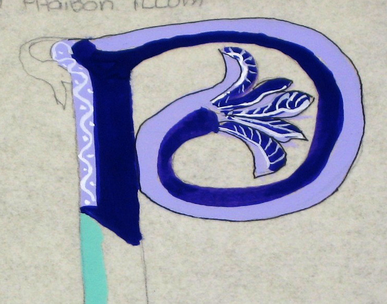
Demonstration of Illuminating a Decorative initial capital letter:
(see Gilding Notes for detailed instructions on Gilding) The handouts were the sample initial capital (an “S”), a piece of pergamenata paper and a piece of palette paper to work on, as well as samples of Lombardic & Versals.


Illuminating a letter:
Choose 3 colors (one of the greens) and zinc white. Gouache, an opaque watercolor, is used for the paint. Place a dab of each color on the palette paper; even if it dries, you can reconstitute it with water.
Trace pattern (initial capital) onto Pergamenata paper. A pencil that you can use for outlining is the Staedtler lead holder, which is a mechanical drafting pencil. Its sharpener has both a sharp & dull setting and also a pad to brush off the excess graphite after sharpening. Use 2H lead.
Paint glue (adhesive for gold leaf, recipe: 2/3 Sobo glue, 1/3 water) onto initial capital with pointed brush (e.g. size 0 or 1). Try to paint on a smooth layer (you’ll be painting 3 layers). Let dry, then paint another layer. Cover the pencil outline.
Rinse brush frequently; don’t let the glue dry on the brush. TIP: Don’t let the brush sit in the water, the tip will be ruined.
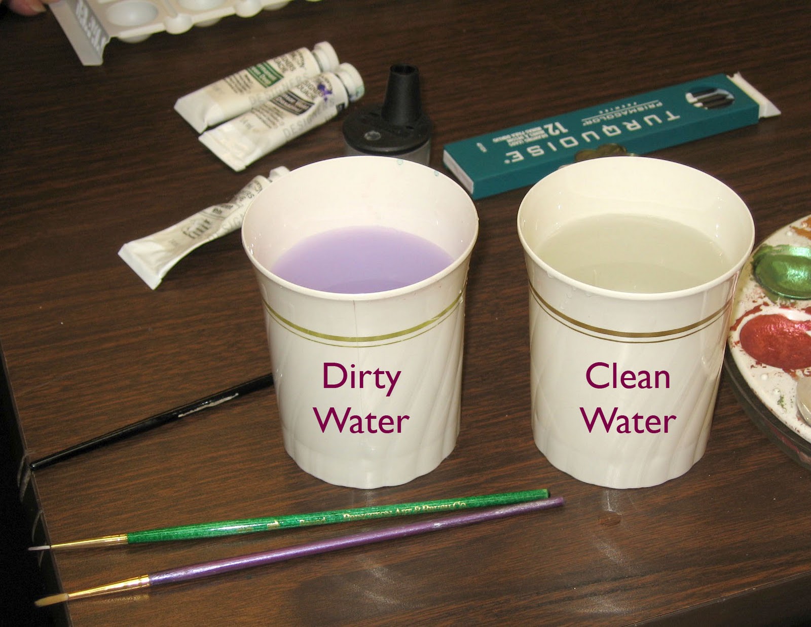
For the colors, put permanent white next to each color. Add the tiniest bit of color, then a drop of water, to mix a tint. (TIP: have 2 water containers, one for dirty, one for clean. Always rinse brush in the dirty container first, then rinse in the clean container).
Don’t paint any of the decorative elements around the “S” yet (you don’t want the gold to stick to the painted areas). You can start painting the decorative elements elsewhere.


Paint each leaf half of one color, half in that color’s tint. Maker sure the first color is dry before painting on the other half.
Once all the leaves are painted & dry, “diaper” them with permanent white gouache. With a small pointed brush (e.g. size 0/0), decorate each leaf with lines, cross-hatching, or dots.
Once the gold leaf adhesive is dry, you’re ready to apply the gold leaf. To prepare, clean a “gold only” pair of scissors with silk – you don’t want any sizing on the scissors or else the gold will stick to them. Cut the sheet of gold leaf to the estimated size of the initial cap.
Breathe on the glue so that it absorbs some moisture. Then place the gold leaf on it and press gently all around. Press the outlines, making sure the sides (the glue will be slightly raised) are also completely covered with the gold leaf.
Remove the backing paper carefully so that you can save any gold that sticks to the paper.
Place a piece of glassine (acid-free, non-stick paper; the Post Office envelopes for stamps are glass-ine) over the gold leaf and press the outlines, making sure the sides (the glue will be slightly raised) are also completely.


Burnish the gold leaf (several types of burnishers in different shapes & sizes: e.g. Griffold, Agate).
Clean up the edges with an X-acto knife with the #16 blade. (TIP: Every calligrapher should have the #11 blade and #16 blade.) Scrape toward you to clean the edges of excess gold.
Paint background of the gold “S” with gouache (choose a color that will make the gold “pop”; e.g. yellow is not a good choice.)
Once you’re done painting, outline the gold “S” with the Micron Pigma 005 pen.
Outline each leaf in black with a Pigma Micron 005 pen.
Paint the stems with the small pointed brush in green, then again right next to that stroke with the green tint.


REMEMBER: with illumination, you can never be too garish!

TIP for drawing a leaf (i.e. a pointy ivy leaf like the ones in the illuminated manuscripts): draw a square. Then draw half-circles on each side. Erase the straight lines of the half-circles & you’re left with a leaf-shape.


Demonstration of painting Versals: Versals are drawn letters. Draw them for the first 2 lines of the proj-ect. Use the Versals handout that DeAnn Xeroxed to the correct size (1/2-inch x-height) to trace them. Paint them in the gouache colors that you’re using in your decorated capital with a very pointy brush.
Tip to decorate the background of your Decorated Capital: Use “diapering” so that you don’t have large areas of just one paint color. Diapering is cross-hatching, or drawing swirling vines, or painting small circles or dots, to fill a solid-color space.
If you feel the margins are too “empty,” fill it with filigree – ovals and figure-eights with a pointed brush, or use a Copperplate nib for really thin lines. Just fill the Copperplate nib with the gouache and draw the filigree lines.

To prevent your block of text from looking like the writing had been written by 3 different people, DeAnn’s advice is: schedule time when you’ll have no distractions because writing takes concentration. Then take the time to set-up your area correctly and have everything you’ll use readily at hand. Write for 20 minutes to warm-up, then write on the pergamenata paper. If you can’t finish writing all the text for your project in one sitting, warm-up for about 20 minutes before continuing the next time.

Thursday, October 14, 2010

October 11, 2010 - Beverly Hills Adult School Fraktur Class #5

NOTE: more photos are coming - thanks for your patience!

Beverly Hills Adult School Fraktur Class #5:  DeAnn went over the illuminated manuscript project and explained the different elements involved. The 2 main handouts were a sheet of Lombardic capitals and a sheet of Versals (Roman) capitals. She also passed out her Gilding Notes and various examples of decorative capitals to the beginners.


Illuminated Manuscript Project Template explanation:  The decorative capital, which is the first letter of your text, goes into the 2 x 2 inch square. The title of your text (whether it’s a poem, excerpt, or song lyrics) will not appear in your piece; nor will the author’s name. The text will continue without spacing or punctuation on the four lines to the right of the decorative capital.


The first two lines (x-height = ½ inch) are the Lombardic capitals. Intermediates can put decorative elements in the first line and have only one line of Lombardics if they want. The next two lines (x-height = 3/8 inch) are the Roman Versals. Then the rest of the text will be written in Fraktur below at an x-height of 1/4 inch with the 1 ½ mm Brause nib.

Ink on pergamanatta:  Students have had difficulty using Higgins Eternal on the pergamenata. It may be easier to use sumi, watercolor, or gouache (more on gouache below).

Example of Illuminated Manuscript project from Gothic Textura semester.

Materials you will need for the Illuminated Manuscript Project:
1. Round watercolor brush with pointed tip; e.g. Winsor Newton Series 7 in size 0 and in size 1 (2 brushes). Because these are expensive brushes, you may prefer to get a version that Utrecht or Dick Blick makes, which will work just as well for this project.
2. Gouache = opaque watercolors. You will need Permanent White and a few other colors of your choice. DeAnn will provide some in class, but if you prefer a certain palette of colors, she may not have all the colors you want to use.
3. Palette for your gouache. This can be a small 6-well plastic palette or one that comes with a cover. Even if the gouache dries, you can reconstitute it with water and it works fine.
4. Micron Pigma 005 Pen in black. This is a very fine tip permanent black ink marker.
5. Pencil with 2H lead (can be a sketch or mechanical pencil; or a 2mm Lead Holder if you have one). A #2 pencil has HB lead. You’ll need one with harder lead for this project so your lines won’t smudge.
6. Pergamenata paper – DeAnn will provide this.

The 1 1/2 mm Brause nib and black ink will be used for writing the text in the Illuminated Manuscript Project. Once you’ve moved down to writing with the 1 1/2 mm nib, practice writing out your text on thin paper (e.g. Cotton Comp from Borden & Riley) placed on top of the template so you can see the guide-lines through it. This way, you won’t have to line the paper each time.

Bring your digital camera so that you can take pictures of illuminated manuscript examples that you like. DeAnn will bring many books on illuminated manuscripts and decorative letters. You can download the photos you take to your computer and resize them as needed to use in your illuminated manuscript project. Search on the web for illuminated manuscript examples; start getting an idea of what type of decorative capital you might be interested in using.

DeAnn showed us samples of gilding and real vellum. For the class project, we’ll be using a mixture of Sobo glue and water to adhere the gold to the pergamenata.


HOMEWORK:  Definitely find the text you want to use for the project; practice writing it. If you’re comfortable with the 2 ½ mm Brause nib, then go down to the 1 ½ mm Brause nib, which will be the size used for the project. However, if you’re still practicing at 5mm, then go down to the 2 1/2 mm. Don’t skip a size – if you’ve been writing with the 5 mm, then go down to the 2 ½ mm (x-height = ½ inch, 4 boxes).

Wednesday, October 6, 2010

October 4, 2010 - Beverly Hills Adult School Fraktur Class #4

Beverly Hills Adult School Fraktur Class #4:  DeAnn went over the Fraktur capital letters. The warm-up was writing the Fraktur letters and words with the 5mm Brause nib. Students came up to have DeAnn critique their writing and demonstrate on their sheet with a Zig calligraphy marker.


The handouts were 6 sheets on capitals:  Fraktur capitals exemplar with ductus (stroke sequence), Fraktur capitals written for DeAnn by German calligrapher Karlgeorg Hoefer (which the exemplar is based on), the Fraktur page from Claude Mediavilla’s book “Calligraphy”, a practice sheet from DeAnn’s past student, and two sheets of capital variations.

DeAnn’s goal is to teach us the Fraktur capitals done in the classic way, then show us variations that we can base modifications on. She also wants to show us different examples so that we can see how the letterforms looked in their historical context. By knowing the alternate letterforms, we’ll be able to recognize the letters when we look at historic manuscripts.


Fraktur Capitals:  these are 7 pen widths tall. For class, use the space from the baseline to the ascender, which is roughly 7 pen-widths (almost 11 boxes on the grid paper). The pen angle is slightly flatter, at 40-degrees, so that the downstrokes are thicker. Study the exemplar and the ductus or stroke sequence. Some of the letters have strokes that can be written in 2 strokes or 1 (noted below).

TIP:  never use these capitals together for a word in all-capitals!

Notes on individual letters:


I :  end the downstroke 1 pen-width (at 40-degrees) above the baseline so that it can meet the second stroke.

J :  like an “I” but end the downstroke slightly below the baseline. The crossbar is about halfway, so roughly 6 boxes from the baseline.


L :  you can make the body of the “L” in 2 separate strokes where you pick up the pen, as on the exemplar (note the wedge shape), or all in one stroke.

T :  stroke 1 starts at the ascender, then make a hairline of 1 pen-width, then stroke down. Stroke 3 has a slight curve going in and going out, but it fairly straight in between.

Alternate T :  stroke 1 is similar to the O-shape (see below). Don’t curve outward too much.

F :  downstroke has a slight s-shape, not a straight downstroke. Press to release some ink and pull a hairline with the edge of your nib for stroke 3.


O :  for the O-family of letters (O, C, G, Q, S), think in terms of the O-shape. Start 1 pen-width below the ascender, go down, then over. Notice that stroke 1 does not curve outward very much.


alternate A

A :  doesn’t look too much like the current A-letterform, so an alternate letterform is provided (see end of exemplar). Note that the alternate stroke 3 is diagonal, not straight up and down like the classic form.


B :  make stroke 2 long enough that it can meet stroke 3 smoothly.

U :  make stroke 2 long enough to connect with stroke 3.

D :  start stroke 3 at least at the margin where stroke 2 starts; can start a little sooner.


H :  don’t make stroke 3 too wavy; it shouldn’t look like a flag waving in the wind.


K :  stroke 4 should end beyond the end of stroke 3.

M :  in your mind, think of stroke 3 as fractures that have been rounded. The crossbar (stroke 5) is a decoration to break-up some of the inner whitespace.


P :  stroke 2 and 3 are slightly above the baseline.


V :  make stroke 2 long enough to connect with stroke 3; if the letter looks like it’s falling over, then stroke 2 isn’t long enough.

X :  an alternate stroke sequence is to continue stroke 1 beyond the baseline to form the descender stroke (stroke 2 on the exemplar). Then the strokes on the right branch off from the stem stroke.


Y :  the last letterform on the exemplar is a “Y” (not an “N”); this letterform appears in historical manuscripts.


Practice writing capitalized words. DeAnn thinks of the texture of Fraktur as lace, like a crocheted lace doily. When writing, be steady and keep going; find your rhythm.


Next week:  DeAnn will demonstrate gilding with gold and how to trace letters onto the sheet for the illuminated manuscript project.

HOMEWORK:  Practice the capital letters. Write alphabet flower names to practice writing words using all the letters. Try alternate capital letterforms from the handout. Once you feel comfortable with the 5mm Brause nib, go down to the 2 ½ mm Brause nib (x-height = 1/2-inch or 4 boxes, 2 boxes for the ascender/descender).

Also think about the text you want to use for the project. It should be about 40 words.