Saturday, November 26, 2011

November 21, 2011 - Pointed Pen Variations Class #7 at Sinai Temple

(more photos to come)
Today DeAnn talked about flourishing. The handouts were 2 sheets that Satomi Wada made for us on flourishing.

Flourishing handout #1 by Satomi Wada
Flourishing handout #2 by Satomi Wada

DeAnn also had us practice until we were “in the zone.” Then later, she had several students write while others observed them.

Class Gallery
Homework by Satomi:
The ink is Permanent White Gouache on red paper


Homework by Sabina:
The ink is white pearlescent.

Sabina drew the baselines free-hand, then measured the waistlines.

Homework by Judith:


Great sampler idea from Brianna:  Brianna wrote detailed notes on each of the nibs she tried on the different papers.
See detailed notes of her observations for each nib.


Flourishing: the three elements of flourishing are circle, oval, and figure 8.

Downstrokes with no pressure.

No pressure – pressure – no pressure strokes:  A fun exercise is to draw a square or rectangle in pencil, then fill it in with these strokes close together, alternating where the pressure areas are, to make a pattern.

Figure 8:  in your mind, extend the lines to complete the figure 8 shape. Don’t let the ends point off into space.

Spirals:  made from ovals. Practice getting them even. Horizontal, clockwise and counter-clockwise. Vertical, clockwise and counterclockwise. No overlap and overlapping.

Direction change:  small loop and full stop.

Draw a diamond shape lightly in pencil to fill in with the figure 8s to help you keep control of the size.


HOMEWORK:  Practice the flourishes from Satomi’s handout. Practice writing out your poem and adding some flourishes.  Next week is the final class.

Tuesday, November 15, 2011

November 14, 2011 - Pointed Pen Variations Class #6 at Sinai Temple

(note: more photos to come)
Today DeAnn talked about writing on good paper, demonstrated how to line paper, and had us write in white ink on dark paper.

Homework by Sabina:
(click on the image to see a larger version; click the x-box to close and return to the blog).
Sabina's alphabet word list of fish
Another version of alphabetical fish by Sabina


Great sampler idea from Flavia:  Flavia made a little booklet out of the different papers used for the different nibs/ink sampler.


Writing in white ink on dark paper:  DeAnn brought several kinds of white ink for us to try. The inks included Pearlescent (Daler Rowney), FW Acrylic, Spectralite, Tri-Art, Pro-White. Some had to be thinned with water so it would flow from the nib or have some gum Arabic added to make it “stick” to the nib.


Sabina writes in Pearlescent ink on the red paper

DeAnn passed out red card-stock which we cut in half to make two sheets. A sharpened pencil is very important. If it’s dull, it will affect the x-height. On one of the sheets, we made a 1-inch margin on three sides (left, top, right). Because the C-thru 18” ruler is 2 inches wide, line up the edge of the paper to the 1-inch mark on the ruler so you don’t have to make any measured marks for the margin. On the small guidelines sheet, draw a line 1-inch away from the margin, then fold it over so that the guidelines come to the end of the paper.

Align the ascender with the top margin line on the red paper. Then make marks down the left edge for the waist and base lines only. Do the same thing on the right side. Then with the C-thru ruler, line the paper by placing your hand in the middle of the ruler to hold it steady, then pulling the pencil from left to right, angled in the right direction. This will sharpen the pencil while you line. Make the lines from top to bottom, sliding the rule down as you go.

TIP:  Line with pencil on dark paper so that you can see the lines when the light hits it at the correct angle; they will look silver-y.


Observations:  Students had difficulty writing on the red paper, both due to the ink and the nib. If the ink is too thick or gloppy, thin with water, starting with one drop at a time. If the ink is too thin and won’t stick to the nib, then add gum Arabic one drop at a time. Nibs that students recommended were Gillot 303, Hiro 30EF, Hunt 56.

Tri-Art ink had to be thinned with water and also have gum Arabic added until it would write.

Judith uses all the nibs to write a sample

TIP:  If the Hiro 30EF nib is hard to push into the pen-holder, try soaking the pen holder in very hot water. This softens the plastic slightly. Then push the Hiro 30EF nib into it. If you can’t take it out later, soak it in hot water again, then pull the nib out.

Reminder on Class Project:  You should have chosen a poem for the class project by now. It should be about 50 words. Even if the poem is much longer, you can use an excerpt.


DeAnn’s recommended papers:
Canson Ingres
See http://www.dickblick.com/products/canson-ingres-drawing-papers/

Canson Mi-Tientes
See http://www.dickblick.com/products/canson-mi-teintes-drawing-papers/

Strathmore Charcoal
http://www.dickblick.com/products/strathmore-500-series-charcoal-papers/


DeAnn had pieces of Arches Watercolor paper, 140 lb. Hot Press for sale. Students could buy a piece to write out their poem for the final project. This isn’t the paper for the final project.


HOMEWORK:  Try writing with vermillion on black paper. Mix white with another color to try on the red paper. Practice writing your project text (poem).  Then if you bought a piece of watercolor paper, write out your poem on that, using any nib/ink you like. You can write on both sides since the paper is thick.


NEXT WEEK:  DeAnn will demonstrate flourishing.

Monday, November 7, 2011

New Classes beginning in January at Sinai Temple

DeAnn will be offering two sessions of Copperplate at Sinai Temple (both are the same material):  Mondays (10:00 am to 12:30 pm) from January 9, 2012 to March 12, 2012, and Wednesdays (10:00 am to 12:30 pm) from January 11, 2012 to March 14, 2012. For more information, please contact Rosa Berman at rbermanr@yahoo.com.

November 7, 2011 - Pointed Pen Variations Class #5 at Sinai Temple

Today DeAnn had us write on different papers with different nibs and different inks. She also demonstrated Jane Shibata’s numbers exemplar.

Detail of Sabina's samples.

Homework by Satomi:

Capitals by Satomi

Homework by Sabina:


Flower names by Sabina

Review:  Vermillion ink doesn’t mix well with all black inks. Most sumi inks don’t work well. Higgins Eternal works best.  Start with Vermillion in your inkwell and add a few drops of Higgins Eternal. Stir with the other end of the pen holder.

TIP:  When mixing colors, always start with the lighter color and the darker color a little at a time. This way you can control the shade and amount of the color you create.

Carin working on her sampler - note her setup.

DeAnn had us write on each type of paper with all the nibs using different inks. The papers were in different colors, textures, and weights.  Guidelines weren’t used because most of the papers are too thick to see through. The goal of this exercise was to observe how the different nibs behaved on the different papers using the different inks. Label nib and ink on each writing sample and record observations. For example, shiny paper may need a sharp nib.

Close-up of Carin's sampler

Best Ink in its original packaging.
The following inks were used:
1. Vermillion ink.
2. Sepia ink: Vermillion mixed with a little of Higgins Eternal black ink.
3. DeAnn’s “Best Ink”, a Japanese sumi ink in a brown bottle. She had dropper bottles of it for sale ($5 + tax).


Writing exercise observation:  One of the papers used is tracing paper. It’s hard to get thicks and thins on it. It’ll be difficult to achieve thin hairlines on any paper that is really smooth. Another drawback is that once the ink is dry, you can scrape it off. DeAnn has addressed vellum envelopes in the past where the ink got scraped off when they went through the mail system.

Morgan's sampler setup

Student Questions:
Why is too much ink coming out of the pen when I write?
Too much ink may be on the nib; wipe the nib on the edge of the inkwell after dipping to remove excess. Look at the backside of the nib; often ink will build up there, so wipe it off in that case.
The ink may not be sticking to the nib well enough, especially when the nib is new or the nib is a Hiro 40 or Hunt 101. In this case, try treating the nib with gum Arabic or in extreme cases, run it over a lit match.
Finally, the ink itself may not have enough gum Arabic in it and therefore not suitable for pointed pen work. (This is not the case in class, since DeAnn provides inks that work with pointed pen nibs)

Why is the pen pricking into the paper?
The paper may be too textured to be used with a pointed pen. Try a nib that’s not very sharp. For example, you can write on watercolor paper with the Hiro 41.
If the paper is not too textured, you may be pressing too hard or using uneven pressure. Try for a lighter touch.

Pointed Pen Numbers:  study the exemplar carefully for the stroke sequence and alternates that Jane Shibata has provided.

Notes on specific numbers:


1:  DeAnn’s alternate – start with an upstroke.


2:  DeAnn’s alternate – looped like an “L”


7:  Another variation is to add a crossbar at the waistline, like the Europeans do.


5:  DeAnn will pull the horizontal stroke toward the body of the 5 than away to achieve a thicker line.

9:  Note that it’s made with two down-strokes (see exemplar).

Class Project:  start thinking about what poem you want to use for the class project. It should be about 50 words. Even if the poem is much longer, you can use an excerpt. DeAnn will talk more about it next week. We’ll be writing it on special paper (not our practice sheets).

DeAnn’s recommended papers:
Canson Ingres

Sample of Canson Ingres colors

Canson Mi-Tientes

Sample of Canson Mi-Tientes colors
Strathmore Charcoal

Sample of Stratchmore Charcoal colors


DeAnn will bring in some samples, but if you want to go to an art store (see the Suppliers page ) and get some to bring to class, feel free. All the papers come in different colors. They’re typically sold by the sheet, 19” x 25” in size. We’ll be cutting the paper down to a size appropriate for the project and lining it (more on that next time). Keep in mind that it’s more difficult to work on darker papers, so if this is your first project, you may want to choose a lighter color.

Sabina's samples

HOMEWORK:  Continue practicing at the smaller guidelines size. Finish trying all the nibs on the different papers if you weren't able to in class. Look for a poem (or song lyrics) for the project. If you find one, practice writing it out.

NEXT WEEK:  DeAnn will demonstrate flourishing. She’ll also show us how to line the paper. Students who’ve taken classes with DeAnn before should bring the C-thru 2” x 18” plastic ruler with the 8x8 grid on it. But DeAnn will also provide them to use.

Sunday, November 6, 2011

Italic and Ink Notes


Tuesday, November 1, 2011

October 31, 2011 - Pointed Pen Variations Class #4 at Sinai Temple

(note: more photos to come)
Today DeAnn demonstrated the Capitals exemplar.  She also went over stroke #5 and made some observations based on her review of the homework. For warm-up, we wrote words and sentences.

Today’s handout was a guideline with a smaller x-height (3/8” instead of ¼”). Highlight the waist-base space (skip 3 lines in between for the ascender and descender space as well as the inter-linear spacing). To download, click on the picture (it will appear by itself against a black background), then Save the image to your computer.


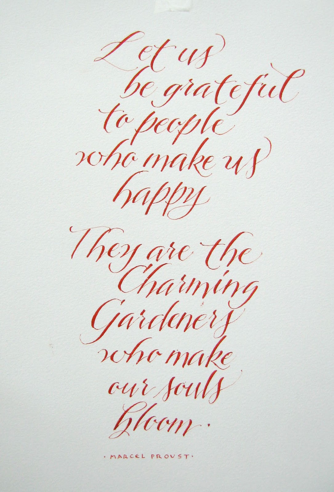
DeAnn brought black Higgins Eternal ink to mix with the vermillion ink to make a sepia-colored ink. Fill one inkwell halfway or so with vermillion ink, then add five drops of the black Higgins Eternal ink. Use the other end of your pen holder to mix. This mixture blends well, unlike some other sumi inks, which bead up in the vermillion ink and never blend together.


Review of nibs:  the Hiro 40 and Hunt 101 nibs make thin hairlines, but can be difficult to “break in”. If several treatments of gum Arabic haven’t worked, try burning the resin off with a lit match. See last week’s entry for details. Or try dropping the nib into boiling water.

Homework notes:  DeAnn noticed that the “e” is often too wide. It should be more oval than round; try compacting it a bit.
The crossbar of the “f” should be on the waistline, not below it. The crossbar should be like a figure-8.

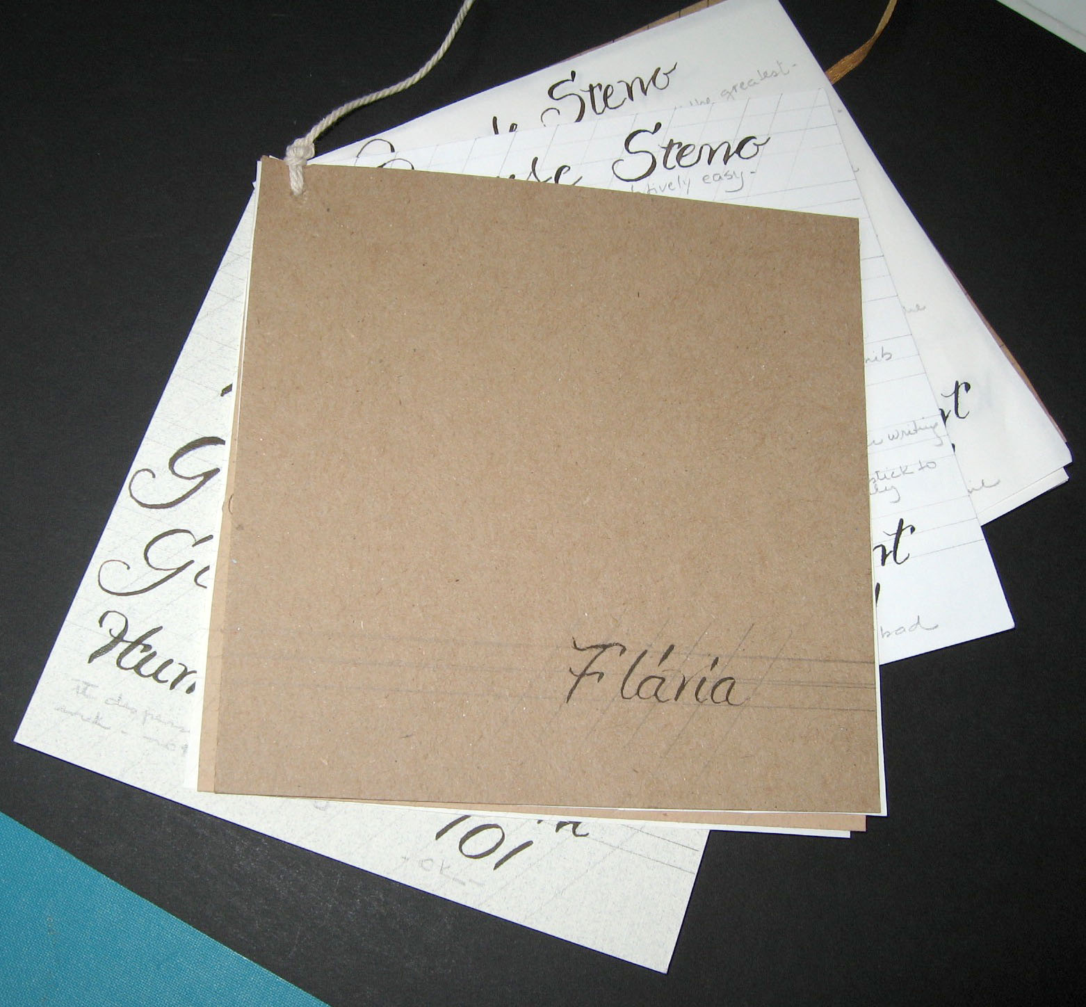
Nib identifier sheet from Satomi:  Satomi created a nib identifier sheet by cutting out actual-size pictures of the nibs and putting it into a sheet protector so that you can tape the nib to the plastic without harming the identifier sheet. Thank You, Satomi!


Making Stroke #5:  set – press – pull (decrease pressure slightly in the middle to make the thick-thin-thick stroke) – stop – release – pull to the right.

Go slowly and carefully; you don’t want a thin line to hang from the bottom right edge. Look closely at the strokes exemplar and read Jane’s notes. Then practice putting the bow in. However, for now, it’s OK to make the stroke straight until your hand gets better at the manipulation.

Capitals:  the size is from the base to the ascender. For demonstrating them on the board, DeAnn didn’t always write in the guidelines. See the handout for Jane’s detailed notes.

Capitals taller than the ascender depending on height of stroke #5.

NOTE: If you look closely at the exemplar, Jane makes stroke #5 from ascender to base-line. This makes her capitals go beyond the ascender for letters like B, , D, P, R, etc. So she makes other letters like S taller than the ascender to be of similar size. DeAnn feels that for herself, this makes the capital letters get too big, so she prefers to make stroke #5 slightly shorter so that the whole Capital is contained within the ascender and baselines. You can try it either way; the goal is to be consistent.

Notes on individual letters:
A:  just like the lowercase “a” – think “Oval”.
2nd A:  first stroke is no pressure, then pressure; it should be very diagonal, more diagonal than the slantline. Start the 2nd stroke just a little bit lower than the ascender for a nice overlap.


B:  stroke #5. Then think of two ovals, the top one a little smaller than the bottom. Go back and thicken the flourish (note:  this is what the little “x” means on Jane’s exemplar – other letters also have this).

D:  stroke #5. Then think oval. Finish by thickening the flourish.


E:  like the “C but with a crossbar. The crossbar should as far as the top (carrot) or even farther.

F:  on Jane’s exemplar, the first stroke is the stem stroke #5, but DeAnn’s alternate is to make the top bar the first stroke so you know where to start stroke #5. Try it both ways.

G:  like the “C” and “E”, then like stroke #6.

H:  first stroke – stop at the baseline and move slightly toward the left. The bottom should be kind of square. For the second stroke – start at the ascender, set – move left – press, then like stroke #4. Crossbar at the waistline.


I:  Like “F”, try making the top bar the first stroke.

J:  alternate suggestion from Jennifer:  start at the ascender and make the stem stroke #6; then make the flourish stroke as the downstroke so you don’t have to go back and thicken it.


K:  Go past the stem at the waistline to make the branch.

L:  Unlike the “I”, the left side is shorter for the bottom bar.
2nd L:  start at the waistline, like a figure-8 to the ascender. Then another figure-8 at the baseline, go past the top of the letter.

M:  like lowercase “m”, start the second upstroke at the baseline and go up the side of the first stroke to branch nicely. Don’t start the stroke where it branches. You want a tangential curve, not an intersection, which flows better.
2nd M:  start with little pressure from the ascender, more diagonal than the slantline. Then imagine a “U”.


N:  the first and third strokes should be the same angle as the slantline. Overlap the S-curve for a nice join.
2nd N:  like the lowercase “n”.


O:  Think of the letter as a big oval; pressurize downstroke to end it.

P:  DeAnn suggests making the flourish side bigger than the bowl of the P. Think of it as a big oval.


Q:  think of this as an oval plus a figure-8


R:  the second stroke branches at the waistline, higher than where the P ends.


S:  think of the “S” contained within a box with sides parallel to the slantlines. The carrot should be contained within the box.
2nd S:  loop above the ascender.
3rd S:  the top is bigger; this is a sign painter’s S, a more modern look.


T:  Like “F” and “I”, DeAnn suggests doing the top bar as the first stroke. Try it both ways.

U:  start like a big stroke #7 that goes into a #3

V:  start like a big stroke #7, but look closely at the exemplar; Jane separates the next stroke slightly.
2nd V:  start like a big stroke #7 that goes into a #3 to the ascender.


W:  stroke #7, but come up and aim toward the ascender. This makes for a better overlap with the second stroke.
2nd W:  like the “U”.


X:  On the exemplar, the first stroke is along the slantline. But DeAnn likes  to make it a little straighter or even going diagonal the other way. This is so the second stroke isn’t so curved, but is straighter. Otherwise, be careful that it starts to look too curvy like a spider.


Y:  like the “W”, stroke #7 but come up and aim toward the ascender, but stop slightly below it. Then a stroke like #6 that goes from the ascender to the descender.

Z:  both are similar to their lowercase versions, but the 2nd Z has a figure-8 crossbar at the waistline.

For Y and Z, observe where they end at the descender. Look at where the curve is leading the eye; you want it to lead back into the letter (i.e. a more oval shape), not out into space.

HOMEWORK:  Practice the capitals. Try tracing them. Use the smaller guidelines. Then practice writing Capitalized words. Never write words all in capitals! See DeAnn’s website for alphabetical Flower Names. Or google “alphabetical lists of words” for other lists. Write one word for each letter all the way through (i.e. don’t write several “A”-words, then a couple “B”-words, etc.). 26 words should fit on one sheet. Then practice text. You can use anything you like, for example poems, song lyrics, alphabet sentences, any excerpt.

DeAnn's Homework

NEXT WEEK:  Trying different nibs and inks on different papers. Those of you who’ve taken calligraphy before, feel free to bring in any other inks and/or papers that you want to try.